— UX/UI —
Unleashing Women's
Inner Strength
Inner Strength

About
The right tools and the right mindset: that's what a woman needs in order to defend herself in an unpleasant situation. This kind of life-saving, indispensable knowledge needs to be shared widely with people across the globe.
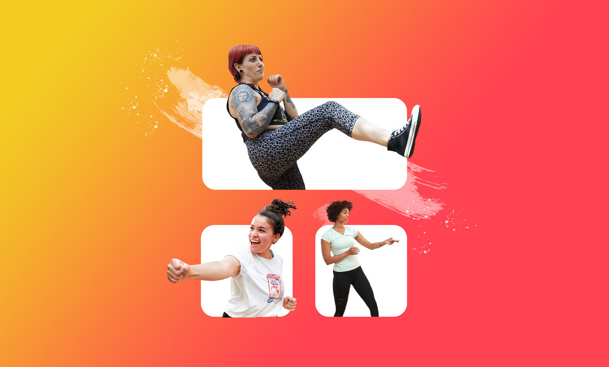
Pretty Deadly Self Defense is a program that does just that. On top of regularly scheduled in-person classes, they also offer a handy app that teaches women the basics of self defense.
I was brought in to re-structure and re-design an existing barebones app. The biggest task before me was presenting information in a clear and accessible. I combined similar content, logically organized its presentation, and paid special attention to the friendliness of the design.
Skills Used: UX, UI, Design, Animation
Tools Used: Figma, Photoshop, Good Barber
Client: Pretty Deadly Self Defense
Logo design: Kseniya Apresyan
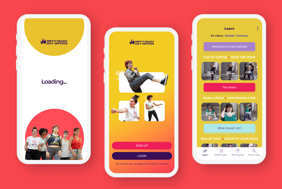
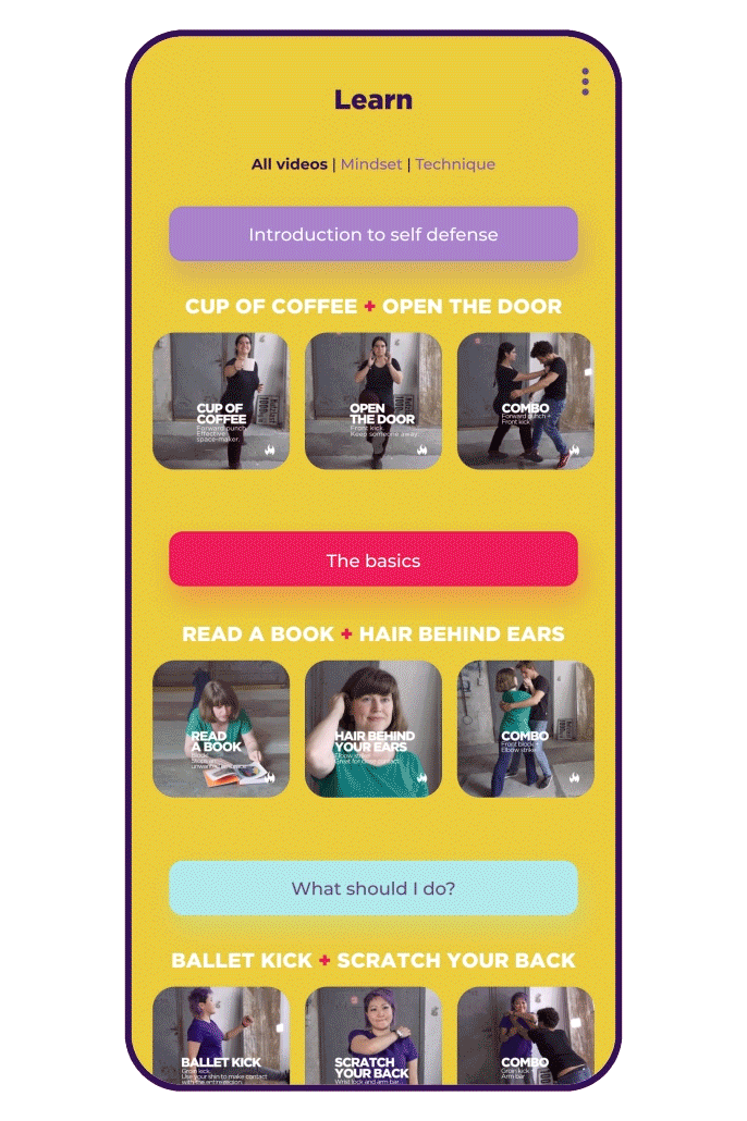
Splash screen, Log in screen, and the Learn tab
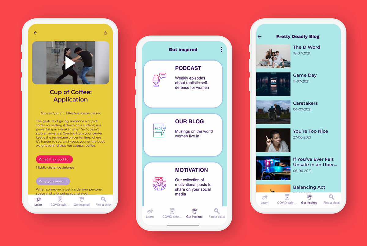
One of the many videos that live in the Learn tab; the Get inspired tab; the Blog category is a live medium.com feed
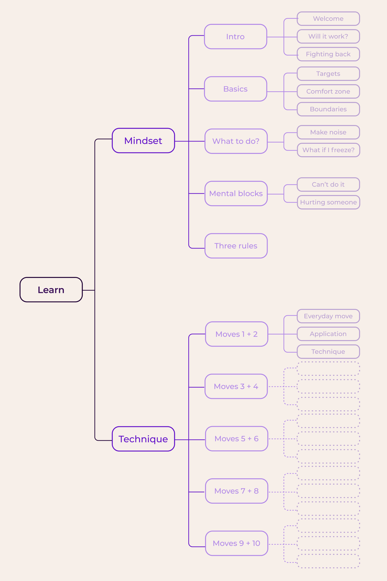
The Learn tab is the most important section of the app. It contains a vast variety of educational videos. I organized the videos by general topic: mindset and technique, with each sub-section splitting into multiple categories of its own. I made sure the navigation felt intuitive by employing additional navigation sub-sections and creating visuals explaining each video category.
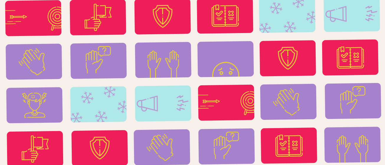
Category visuals created for the app. L to R: Targets, Push past your comfort zone, Boundaries, Three rules of self defense, What if I freeze?, Make some noise, Welcome, How do I know this will work?, Fighting back, What if I hurt someone?
Helping Keep Track of Medication
About
Medication is an integral part of many people's lives. Regularly taking one's pills helps folks keep unwanted symptoms at bay and improves their quality of life.
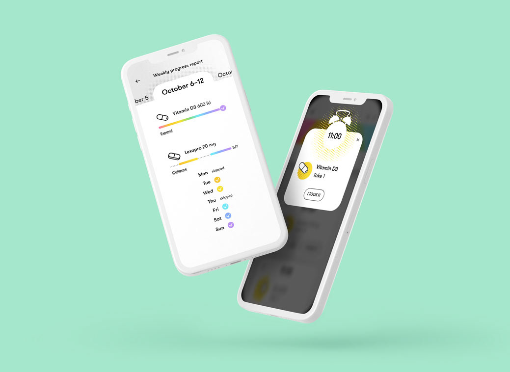
Take Your Pills is an app inspired by rainbow-colored physical pill planners. It color codes each day's medications and allows for intuitive horizontal navigation between weekdays: simply swipe left to see the next day.
Take Your Pills is an app inspired by rainbow-colored physical pill planners. It color codes each day's medications and allows for intuitive horizontal navigation between weekdays: simply swipe left to see the next day.
In-app reminders help folks stay on top of their meds and the Weekly Progress Report feature allows them to see their past week at a glance.
Skills Used: UX, UI, Design, Animation
Tools Used: Figma, After Effects, Lottie
Client: Take Your Pills
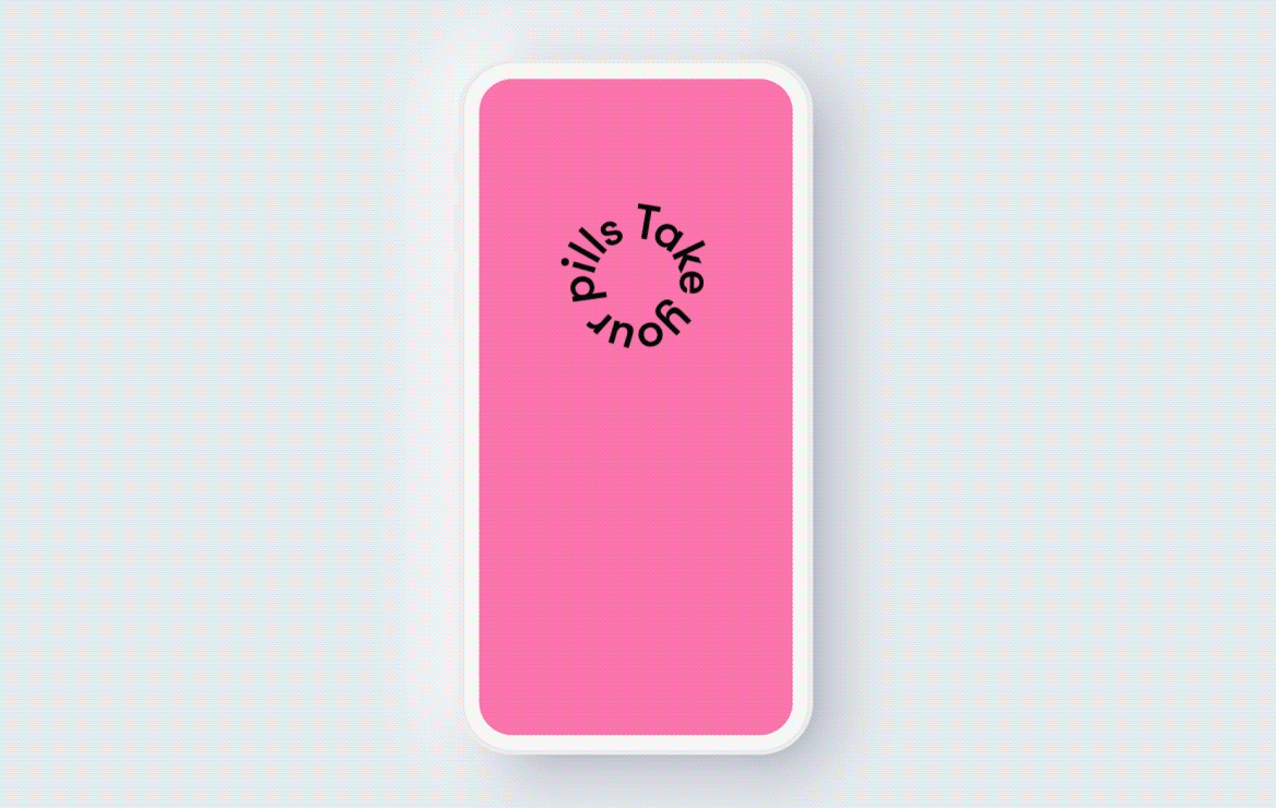
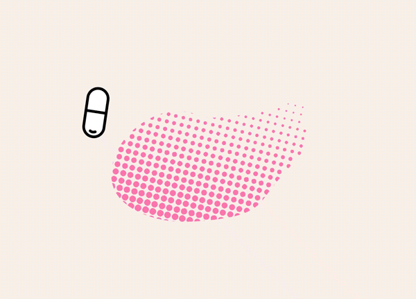
I created this joyous color-coded animation for the app's loading screen.
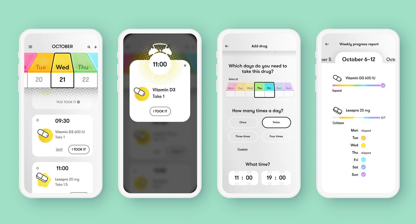
From L to R: Calendar view, App reminder, Adding a drug screen, and the Weekly progress report
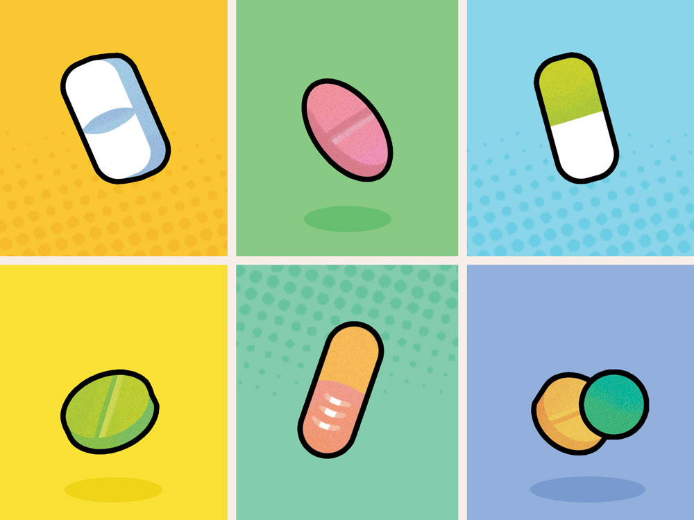
L: pill illustrations for the app. R: interstitial animation used when loading up pill information
Making Swapping Items Fun

About
Caboodle is a fast-paced item swapping app based in the US. I was brought on as the lead designer and helped define the app's UI and UX from the very start. My main goal was to create a framework that would support the app's core functionality: giving and getting an item. The onboarding user flow gives players a taste of the app's core gameplay. Giving an item is explained through a separate FTUE flow. Additional app features such as powerups and item preferences are laid out in a clear, engaging manner.
Skills Used: UX, UI, Design, Animation
Tools Used: Figma
Client: Caboodle
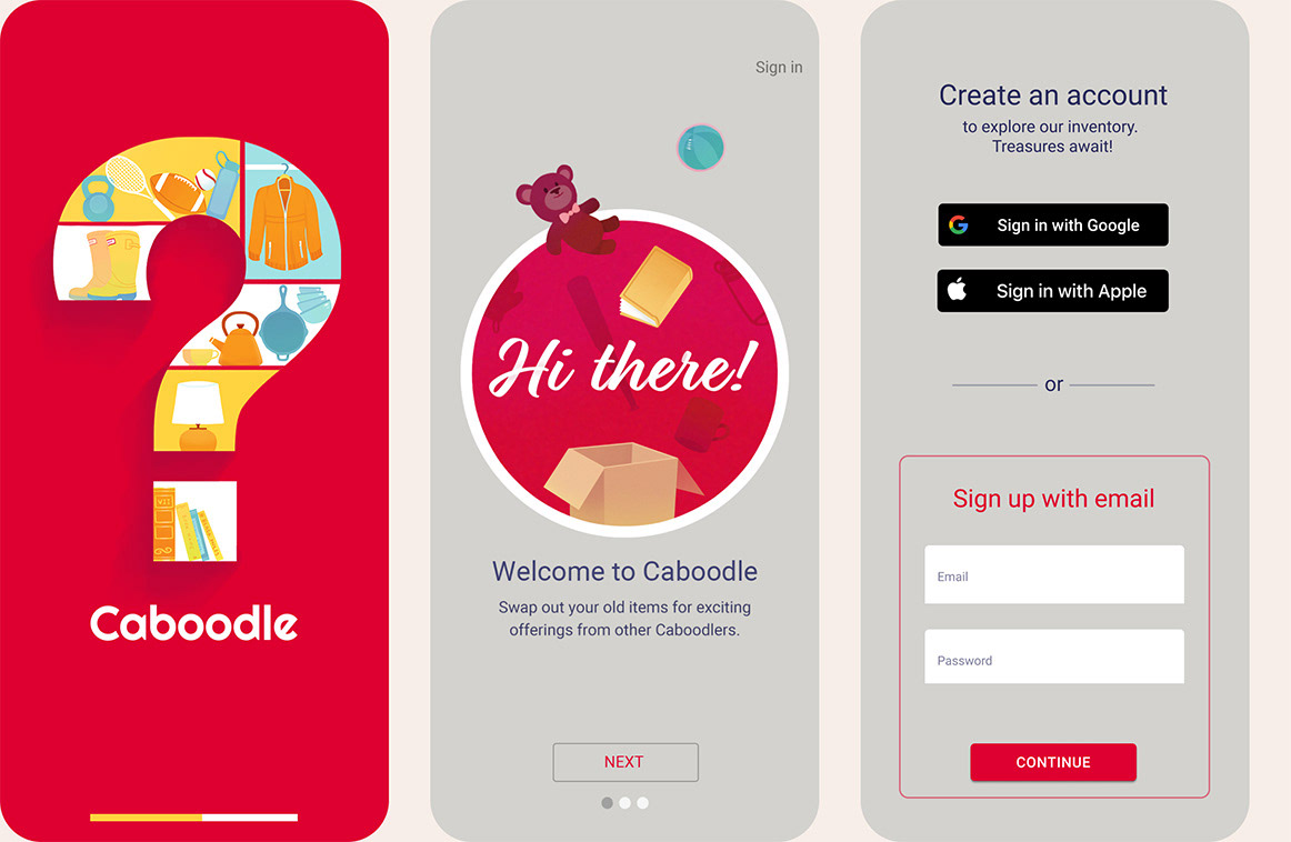
Select screens from the Onboarding Flow
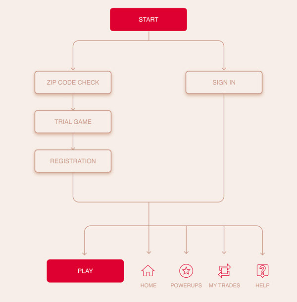
Onboarding Flowchart
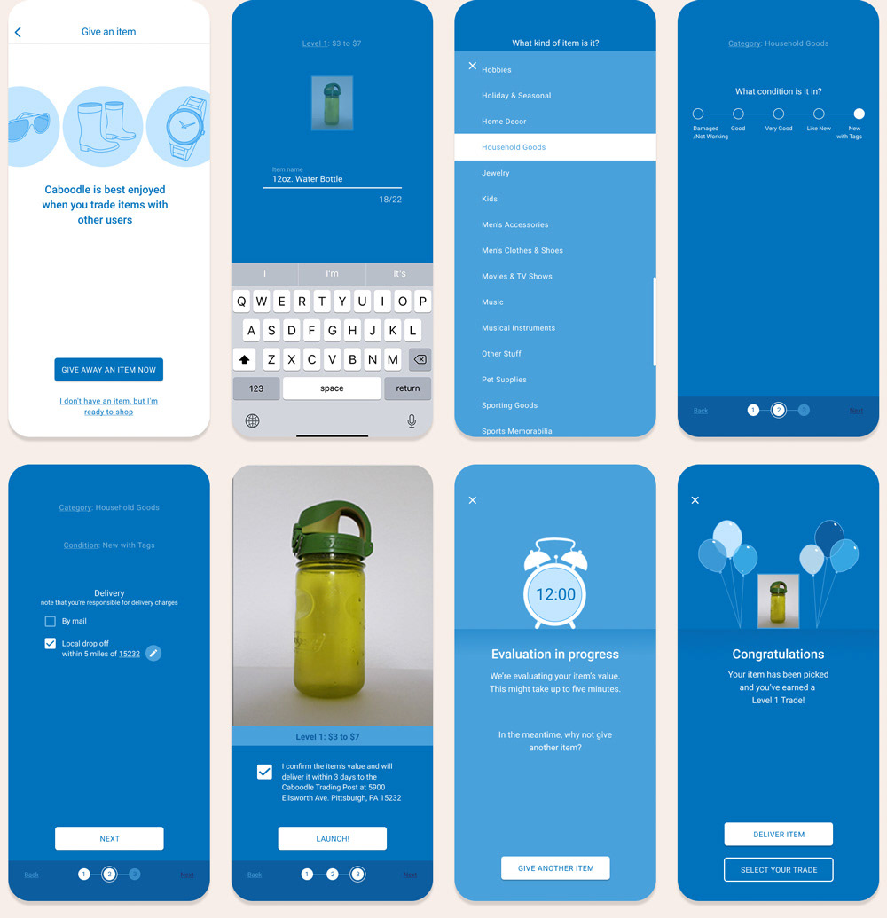
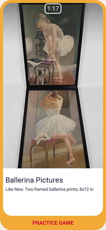
From Left to Right: visualisation of the Give an Item flow; corresponding UI
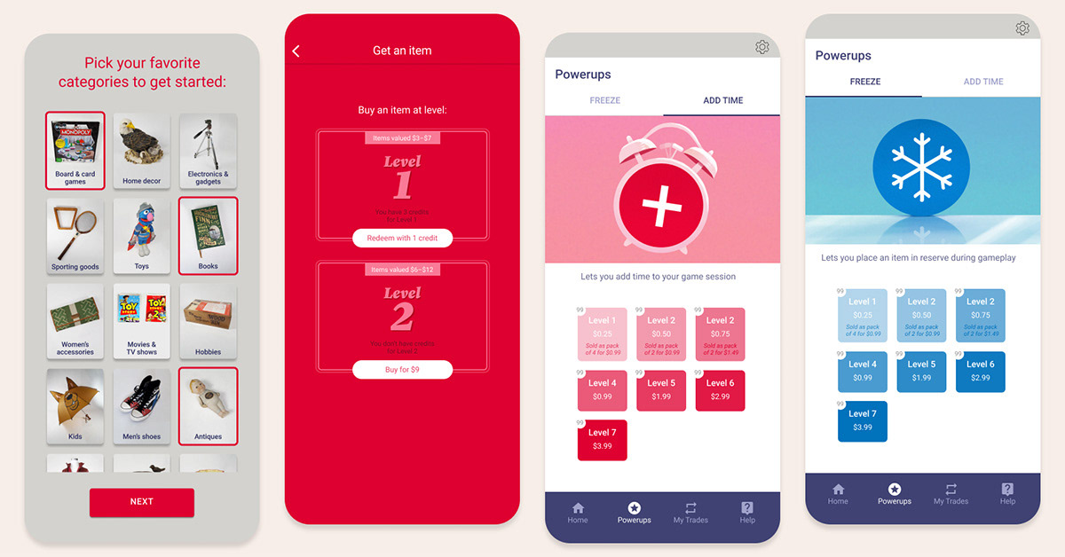
Additional screens: user preferences, level selection, powerup purchase